Project detail
Credit Management System for Mashreq Bank
Redesigned Credit Initiation, the starting point for every corporate loan at Mashreq Bank, into a guided, search-first workflow for Relationship Managers.


Role: Product Designer (UX + UI) at Gloify, working on Mashreq Bank
Team: Product Manager, Business Analysts, Developers, QA
Timeline: 2025 – 2026
Platform: Web · enterprise banking (Credit Lifecycle Management)
My scope: Workflows, IA, wireframes, high-fidelity UI, prototyping, usability reviews, developer handoff, design QA
Status: In beta
TL;DR
Problem: Relationship Managers (RMs) juggled several tools, recreated customers who already existed, and filled in hundreds of fields, with errors only showing up at the end.
What I did: Turned Credit Initiation into one guided, search-first workflow: search before you create, one step at a time, fields that appear only when relevant, AI-assisted document prefill, and validation at every step.
Result (beta): Less duplication, cleaner data, clearer progress for RMs, and reusable patterns for the next CCLM modules.
Every corporate loan starts here, so every mistake travels downstream
Credit Initiation is the first step in Mashreq Bank’s Credit Lifecycle Management (CCLM) platform. Every corporate lending request begins here, and what gets captured feeds every step after it:
Credit Initiation → Financial Spreading → Credit Risk Rating → Credit Proposal → Approvals
When the entry point is slow or error-prone, every downstream team inherits messy data.
What was slowing Relationship Managers down
Fragmented workflow: RMs bounced between multiple tools to complete one application.
Duplicate customers: existing records were often recreated, adding operational risk.
Long, dense forms: hundreds of fields on screen at once.
No sense of progress: users couldn’t tell what was done and what was pending.
Late validation: errors surfaced at the end, creating rework.
The goal wasn’t to remove business complexity. It was to organise it into a workflow RMs could complete with confidence.
What we set out to do
Efficiency: cut repetitive work and unnecessary navigation.
Data quality and compliance: capture accurate data early.
Confidence: make progress and next steps visible at all times.
Scalability: create patterns the next CCLM modules can reuse.
All of this had to work within regulatory and compliance rules, legacy business logic, large datasets with complex entities, multiple stakeholder review cycles, an existing design system and sprint-based delivery.
Mapping reality before designing
I worked with Business Analysts and domain experts to understand how applications were actually created: requirement workshops, stakeholder interviews, legacy workflow analysis, journey mapping for key RM scenarios, and a heuristic review of the existing screens.
This separated true business requirements (must keep) from legacy habits we could redesign.

Who I designed for: the Relationship Manager
Goals: create applications faster, avoid rework, always know an application’s status, and submit with confidence.
Pain points: long forms, duplicate information, poor orientation and compliance anxiety.

Five principles behind every screen
Reduce cognitive load
Prevent errors early
Make progress visible
Design for interruptions (save and resume)
Build reusable patterns
Six decisions that reshaped the workflow
Each decision maps directly to one of the problems above.

1. Search first, then create
The workflow starts by searching existing customer records before anything new is created. Reuse becomes the default, which keeps data clean and cuts reconciliation work.
2. One guided flow instead of one giant form
The single massive form became clear stages, so RMs focus on one task at a time while the full journey stays visible. This fixed the missing sense of progress.
3. Show fields only when they matter
Fields appear based on entity type and business rules. That reduces noise without hiding anything mandatory.
4. Let AI do the typing, keep people in control
RMs upload supporting documents and AI extracts and prefills the data. Testing showed people needed clearer review-and-confirm moments, so I added explicit verification before the extracted data is accepted.
5. Tables built for scanning
Search, filters, sorting, pagination, status indicators and quick actions keep large datasets manageable.
6. Catch errors where they happen
Inline, step-level and summary-level validation, with clear copy, lets RMs fix issues as they go instead of at submission.
A flow that follows how RMs already think
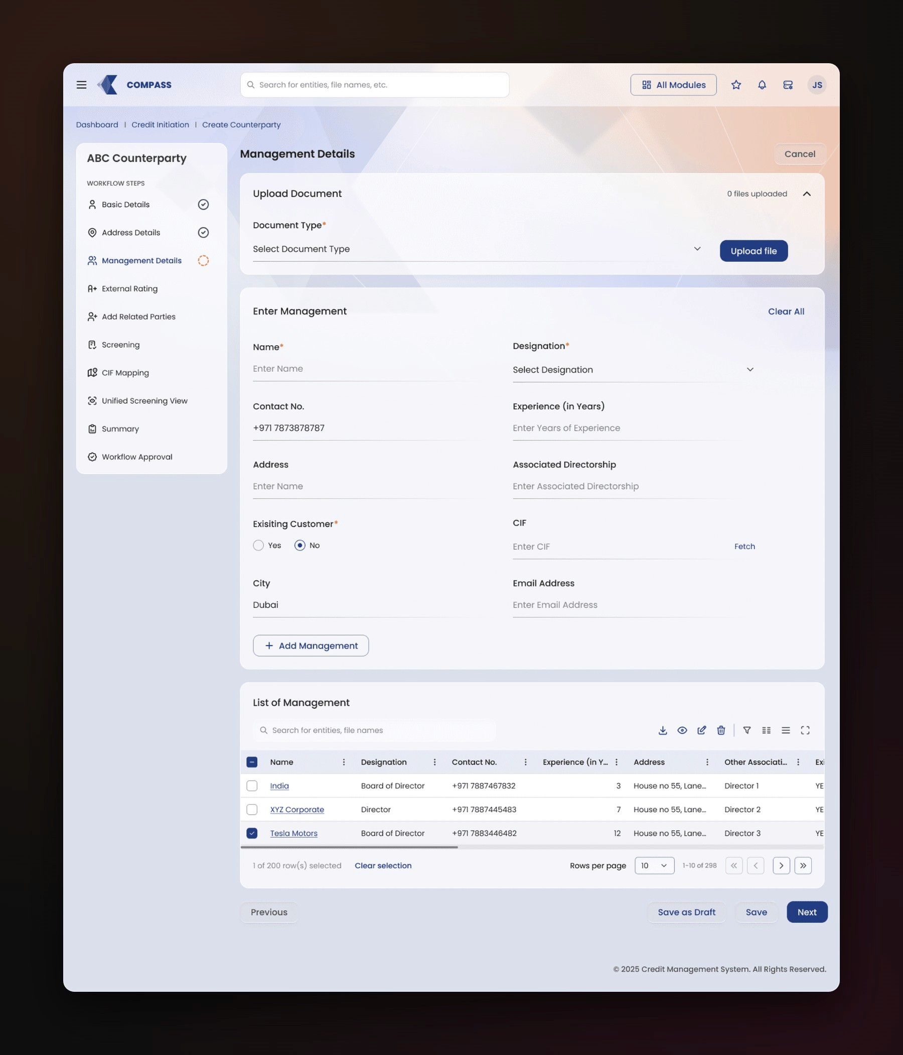
Instead of one long form, the journey is split into sections that match the RM’s mental model:
Basic Details → Address → Management → External Ratings → Related Parties → Screening → CIF Mapping → Unified Screening View → Summary → Workflow Approval

Chunking the journey lowered cognitive load without dropping any required information.
From wireframes to high fidelity
I explored several wireframe directions to test step progression, information hierarchy, search-and-create behaviour and the dashboard layout. The final screens use the existing design system and are tuned for fast scanning, consistency across steps and tables, and enterprise density without clutter.
The module has 100+ screens. These are representative.


Testing and quality before build
I reviewed interactive prototypes with stakeholders and domain experts to check whether key tasks could be completed and where confusion remained. Before build, I ran a UX audit with engineering covering layout, typography, spacing, components and copy.
Guided navigation improved orientation.
Simpler labels reduced ambiguity.
Validation messages became easier to act on.
The AI upload step needed clearer review-and-confirm moments, so I added explicit verification and kept AI upload only in Basic Details.
During implementation I delivered specs for components, states, interactions, validations and responsive rules, and ran design QA on the build.
Impact (beta)
The module is in beta, so impact so far is qualitative:
Better visibility of where each application stands
Cleaner data through search-first creation and continuous validation
Less duplication, with customer reuse as the default
Lower cognitive load from chunked IA and progressive disclosure
Patterns ready to reuse in future CCLM modules
What I learned
In enterprise UX, structure beats simplification.
Aligning early with BAs and developers prevents late redesign churn.
Hierarchy and copy can improve usability more than new features.
Design systems matter most when workflows get large.
Tight feedback loops beat perfect testing.
Want the full walkthrough of the module? I’m happy to take you through it in an interview.
